Autoconstrucción: a definitely unfinished inefficient unstable affective emotional delirious joyful affirmative sweaty fragmentary empiric weak happy contradictory solitary indecent sensual amorphous warm and committed index
 Autoconstrucción (loosely translated as self-build) refers to a particular method in home construction. Those who don’t have the economic means to complete an entire house (but have enough for parts of one) build structures in stages using whatever resources are available at their disposal. And as situations change or families grow, additions and modifications are made to the home that may not use the same material used in the last stage of construction, depending on circumstances. Visually, these developments can be a mish-mash of styles; architecturally, its a responsive approach to building, constantly trying to meet the needs of the inhabitants inside and the neighborhood outside.
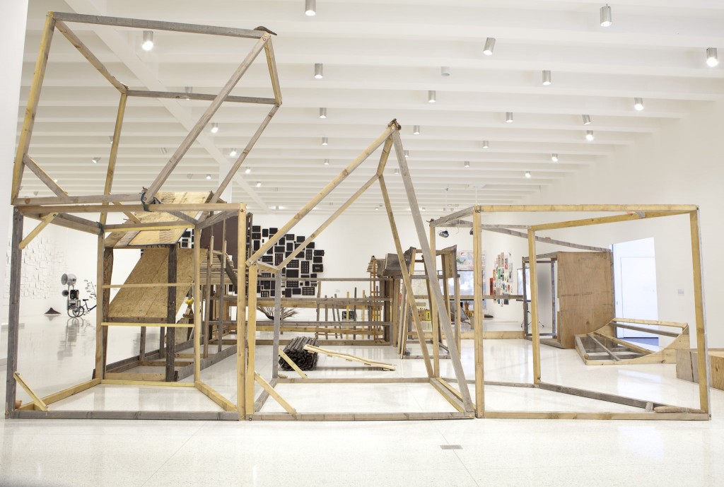
The Autoconstrucción Suites is the latest survey of artist Abraham Cruzvillegas’s decade-long investigation of this phenomenon and how it informs his work. Born and based in Mexico City and growing up in a self-build, that experience is the basis for many of his projects, which range from sculpture to song-writing, drawing to performance, film and writing. Curated by Clara Kim, the exhibition brings together all of these thoughts and moments into a singular gallery space, and creates a world where this line of research takes the form of decaying maguey leaves, a rough splat of concrete, painted cardboard boxes on a wall, a chrome sphere on the floor, or even a tricycle with an audio/visual system built in. A 240-page catalogue accompanies the exhibition, and is conceived as a primer into the language of self building and a container for his research and works.


Warm: a warm system means an organic organization of re-arrangable elements, in which subjectivity, affection, emotion, but mostly needs, rule. An exhibition or a book can be warm systems.
In our first meeting with him to talk about the catalogue, Abraham brought a couple of books from his own collection that he was formally and conceptually interested in. One was this great Filliou catalogue, where everything—from artworks to text entries and random references—was organized in an alphabetic index; on one hand, it’s a pretty academic structure, but weirdly enough, that framework also introduces an element of randomness, with illustrations and reproductions and texts thrown in next to each other at unexpected moments. Another was a Duchamp book that actually comprised of several printed editions housed in a book-like folder, and included reproductions of artworks, small publications and even a little paper sculpture you could assemble. The density of information and the variety of ways to experience the work was really appealing to us, but how much could we achieve with just a plate section and a couple of essays?
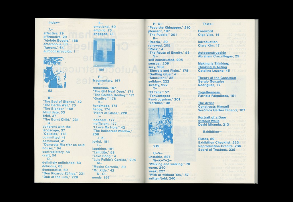
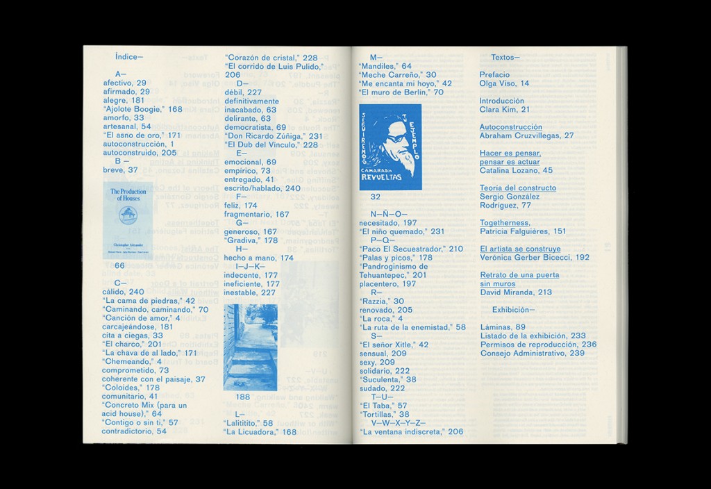
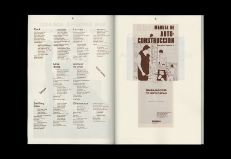
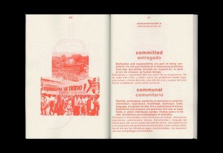
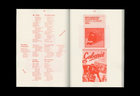
Abraham then casually mentioned including a text he had just prepared a few months prior, a list of autoconstrucción terms and his personal definitions he uses not only to describe his work, but everything: love, life, food, sex, etc. (Some of these terms are scattered throughout this blog post). They waver between serious and light, pithy statements or heavy assertions. We thought it compelling enough to establish a basic conceptual structure for the book, a way for readers to engage with the work on a philosophical level. Above, the English and Spanish versions of the table of contents are structured as quasi-indices, listing all the individual terms as well as the titles of his songs and is an idiosyncratic way to see the range of information contained.
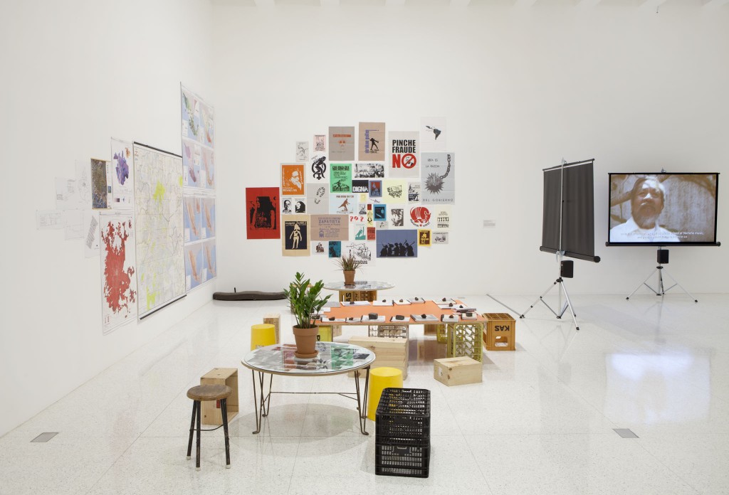
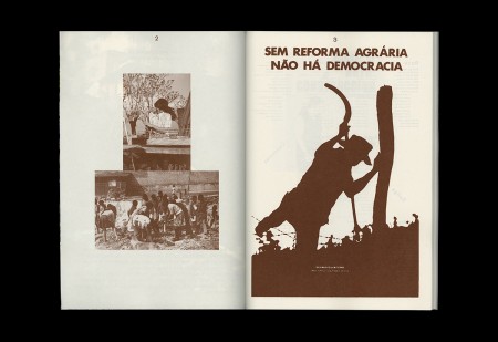
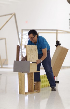
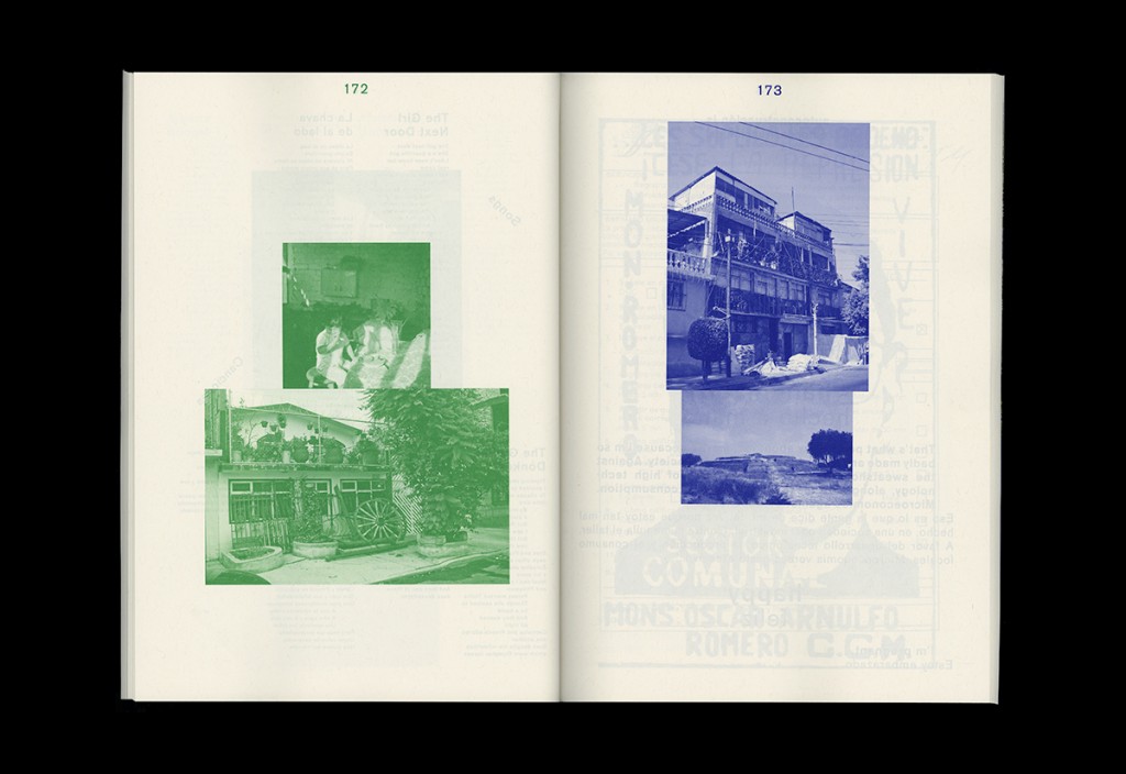
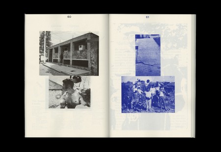
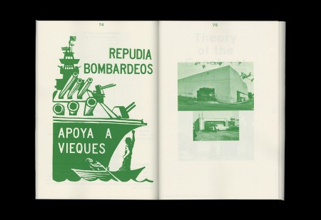
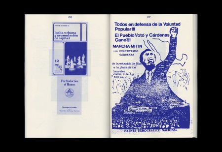
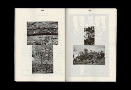
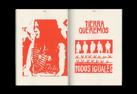
Abraham’s resource room is a work in the show that was important to the development of the book. Pictured above, it’s made up of different elements: on a long table there are coil-bound photocopied books about things like architecture, poetry, and Mexican culture; upside down buckets and a converted wheelbarrow serve as seating; on a nearby wall, several large maps are displayed, showing growth and population densities in Mexico City over time; on a circular table a plant sits on top of a collage of photographs, images from his neighborhood that Abraham had taken with a point-and-shoot; and on another wall, a wall of Mexican and Latin American socio-political posters.
We thought about the project in this particular context and environment, and liked the idea that maybe the catalogue could potentially inhabit this specific space, or at the very least were related somehow. The room comes off as a little cosmos of ideas, as if an encyclopaedia had exploded onto the walls of a gallery. If this room was the big-bang, what if the book was the big-crunch version of the entire installation?


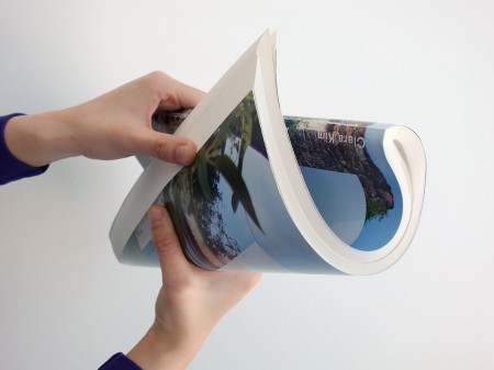
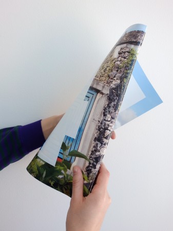
So from these initial thoughts, we started to determine some major moves. The book would be structured in two parts: the core would house works in the exhibition, a 64-page plate section; wrapped around that center is the autoconstrucción universe: the constellation of songs, photos, posters, books, and index terms that he pulls from, in addition to the contributed essays. Because we were literally looking to nest these sections, we decided to saddle stitch the entire book (surprisingly easy to do, despite it a 240 page book, if you find an industrial stitching machine in Stillwater that sews sailboat sails together). The book is softcover, and gave the overall catalogue a very floppy, flexible feel.
Abraham later joked that he could use it to swat flies.

Unstable: piling things atop of each other, not definitely fixed, makes stacks of transformable energy about to collapse. Here I’m talking of history, economy, society and culture. Physical and conceptual instability are something hard to sustain, but I like it.
I usually try to analogize my projects in unusual ways, to introduce a different way of looking at a particular problem. During our conversations, I kept referring to this metaphor of “the book as brick.” The comparison seemed appropriate for some reason: brick as a blunt object, brick as a singular unit, brick as a constructive force, brick as a destructive force, brick as a weight, brick as potential energy. The homely brick suddenly became loaded with things like personality and tone, conceptual ideas beyond its simple functional aspect. We thought it could be interesting to link the resource room to this strange analogy somehow, and view the elements of the installation as raw material from which he constructs the autoconstrucción world. Maybe these images—of his neighborhood, of the books, or the posters, or even the songs he wrote—were individual bricks.
So for this book, instead of laying images out on a pre-determined grid, or just simply centering everything with space in-between elements, what if we just stacked all the images on top of each other?


So we did. And we liked it.
This reminds me of Carl Sagan’s thought experiment of two-dimensional shapes, living on a flatland, having to deal with the realization that there may be other dimensions beyond their perception. It brings up an interesting idea as a book designer, about the way we work with flat surfaces, and where our own perspective lies as the designer: are we the flatlander, or the booming extra-dimensional voice from within? And from there, it was kind of strange to think about creating a sense of weight in a “space” like a page in a book. But after this stacking strategy came up, it introduced another dimension, maybe it was height, maybe it was volume?
This weirdly enough also sort of recalls those cup stacking championships, which was a funny way to think about Abraham’s work, on a couple of different levels: ideas about sculpture as a gesture, or series of built up gestures; and also about improvisation, as if the artist just stacked the images himself. And in the end, this new shape becomes much more interesting than a couple of squares and rectangles on a page. The content can now be activated because of its new shape, like the way that Abraham’s process creates new objects, but that object serves to highlight the individual components of the piece. Cups become pyramids, and debris become sculpture.


Once this was all figured out, the system kind of took over and designed itself. And I think I use the word “system” very loosely, in the sense that it’s not really what we would think of (in a design context) as a tightly gridded out document. The strategy was more like an overall attitude or an outlook, a little less concerned about the final product and more interested in the process. It was also kind of a game we devised for ourselves, whose only rule was to stack the images in weird and interesting ways. And as a graphic designer, its interesting when you introduce an element of play like that. For this project, that quality allowed us to be very responsive and flexible to our own immediate needs and whatever random issue the world threw at us, whether it was not being able to secure rights for an image, or something being too low resolution to print. Whenever something like that happened, we were able to quickly shift images here and there, create new piles, and then move on. It’s pretty liberating not having to stress over minutae when you don’t build it into the structure.
Joyful: inventing the rules of a game to be played everyday in different ways. Rules are dictated from specific needs, then it can be played capriciously, with ingenuity and pleasure. If the game can be played collectively it could go better, depending on the people you invite and on their will to share, learn and risk together. Rules can also be modified, according to peculiarities of context, timing and circumstances.

We applied the same strategy to the text pages, setting the type in columns and having the width of each paragraph vary, again, to give the impression of blocks stacked on top of each other. This happened to be pretty helpful, given the bi-lingual context of the catalogue, and is (hopefully) a helpful device that readers can use to determine where in the translation you are between different languages.
This move sort of shifted the piling metaphor into a different territory. After typesetting these, I started to see these columns of type as a kind of strata, or sediments that have settled on on top of another which compact over time and turn into a new and solid form. I haven’t tried this yet, but one could potentially take a couple of copies of the book and stack them on top of each other and represent each essay a one long geologic cross-section. The essay became something you excavate, sifting through layers of information rather than rock; and with some essays, sometimes there’s something to find, and sometimes there’s nothing but more dirt under there.
And like strata, autoconstrucción becomes a way to understand the world of objects as things made up of a variety of moments and ideas, rather than something singular and isolated. Each layer, whether it’s a particular building material, or a line from a song lyric, or a photo in a stack of images, tells its own story about where it comes from, how it is used, what its particular function is, unintended or not. While the combinations of these layers might be novel and exciting, Abraham’s work recognizes that our own constructions don’t manifest themselves out of thin air, but are built upon (and are sourced from) the context of prior knowledge. The mix may be as homogenous as concrete or as chunky as a stack of crates, but looking closely, you might start to realize that maybe the sum of its parts can be greater than the whole.
Fragmentary: contradictory elements making a whole, there’s no chance for mistake. Tales are short moments of experience or imagination. Married pieces from clashing contexts make beautiful conversations. A book of tales makes a universe.
Abraham Cruzvillegas: The Autoconstrucción Suites is currently on view in Target and Friedman Galleries until September 22, 2013. Afterwards, it will be travelling to Haus der Kunst in Berlin in 2014, and then Fundación/Colección Jumex and Museo Amparo in Mexico City in 2015.