A book has four dimensions. Or, in the words of Ulises Carrión, “a book is a sequence of spaces”, involving both temporal and spatial aspects. Without books, Art, Design & Theory would be nothing. Books are as vital to the visibility, validation and appreciation of thought and practice as museums, galleries and schools, yet tend to be utilized more as a means of documentation and dissemination than as sites of enquiry, exhibition and discovery.

Booksfromthefuture is a summer school in London run by artists/designers/writers Joshua Trees and Yvan Martinez. For two weeks, twenty international participants were each asked to produce a catalog for artist Jaime Gili, one of which would be chosen as the final publication, while the other proposals would be displayed at a future exhibition of his.
As straightforward as that sounds, the two were not interested in producing something conventional. They tasked students to approach the book design conceptually, creating something that explores the aesthetic and physical aspects of ‘bookness’, and open to critical investigations of context and function. The following is a recent interview I had with Joshua and Yvan about when a book is more than just a book, and what they learned this summer.
![]()
Hey guys. Tell us a little about yourselves.

We live in the London Borough of Hackney; De Beauvoir Town, to be precise.
For the past fifteen years we’ve been collaborators. Alongside Booksfromthefuture, we both teach at Central Saint Martins and the London College of Communication.
What compelled you two to start Booksfromthefuture?
Ever since we started teaching we’ve talked about opening a space that functions as a counterpoint to both education and industry; where the hierarchy between student and tutor and between designer and client is flattened into a collaboration of equals; and where the criteria for the success or failure of a project is determined together.
That’s an interesting way to think about it, where that top-down model is probably efficient in teaching very specific and controlled information, but not necessarily conducive towards the unexpected.
In the United Kingdom, many tutors prefer to play the role of ‘facilitator’ rather than ‘art director’, which is cool but it’s a false flatness because at the end of the day the tutor is the one giving the grade in relation to often inflexible criteria.
So what does a more ideal flatness achieve?
For us, striving to flatten the hierarchy is ultimately about the negotiation of outcomes, allowing for experimentation with the relationship between user, content and system. We would like to think that if there is a genuine exchange of ideas going on between all participants, it will be reflected in the final outcome.
![]()
![]()
![]()
![]()
![]()
![]()
Can you give us a sense of what a typical day at school is like?


The morning usually kicks off with either an editorial meeting or discussion of a reading, followed by a freestyle working session with both tutors and students working and taking turns orbiting around to answer questions or troubleshoot technical issues. It’s a bit like Pee-wee’s Playhouse with visiting practitioners popping in at various points to give a presentation or to offer feedback. In the afternoon we rotate between a variety of crit styles to push the work to its fullest potential. Some days are more theoretical than others, but we try to maintain a balance between thinking and doing.
![]()
![]()
![]()
![]()
Why were you two interested in using Gili’s work as a point of departure for your brief?


We see Jaime Gili as a ‘comprehensivist’, a term that Buckminster Fuller coined to describe cross-cultural and transdisciplinary thinkers and doers. Gili’s painting knows no boundaries and thrives on any surface at any scale — poster, motorcycle helmet, boat, barrio, train station, private residence, squat, skyscraper, industrial storage tank, you name it. This, coupled with his open-mindedness about us bringing a conceptualist approach to the formalist genre of the artist monograph, made him an ideal candidate for investigating the book as yet another site for expanding and experiencing both his work and ours.
![]()
![]()
![]()
![]()
When you were discussing the project, did you make a distinction between an artist book and a catalogue for an artist?

.JPG)


We analyzed both genres — artists’ books and art catalogues — in order to avoid them. For this particular workshop, we weren’t interested in the book as a means of documentation or historicization. We consider books to be spaces in their own right that can offer a unique, more direct or intimate interaction between artwork, text and reader than museums or galleries which tend to be very hands-off-the-merchandise environments, even today.

Our thinking is aligned with Ulises Carrión, who conceived the category of ‘bookworks’ for ‘books in which the book form, a coherent sequence of pages, determines conditions of reading that are intrinsic to the work.’ By intrinsic, Carrión meant coherence between the work’s messages (content), appearance (form) and reading process (rhythm). Bookworks may at first glance look like ordinary books, but upon closer inspection, embrace and exploit the sequential and physical aspects of books as spaces and modes of interaction, as opposed to neutral containers of content.
With that in mind, how do you think print-on-demand technology affects what you’re trying to investigate here?
Digital technologies continue to transform how books are accessed, produced and experienced, but this presents the perfect opportunity to rethink and perhaps free printed books from their former functions, towards a different kind of reading experience.
We’re all for the revolution of publishing and reading, and in fact, the books that were produced during our workshop are being printed using both fringe and popular methods. The final book is being printed with a risograph stencil duplicator, and the rest are being printed digitally via print-on-demand for Jaime Gili to showcase in one of his future exhibitions. Would that be an exhibition within an exhibition?
Or an exhibition within a book, within an exhibition! Kind of meta? That sort of brings up another point: do you then feel like your role is maybe analogous to a curator?
In this particular scenario, yes. Exploring the book as a space involved two interconnected curatorial frameworks: macro and micro. The macro was about defining and structuring the opportunity. For the micro, Jaime’s entire digital archive (over a decade’s worth of material) was handed over to the participants with the request to curate and display the collection in relation to the macro, including a title for the book.
That’s rare than you get to work with such a comprehensive range of content. But do you guys think it’s possible to represent everything in book format? Does it matter?
Now that such accurate and immediate forms of documentation exist, maybe artists and curators should use the book format as a portable extension of an exhibition rather than a means of reproduction, enabling people to appreciate the work from different perspectives or even offering content unavailable within the exhibition.

So I am wondering at this point, how do you two define conceptual book design?
‘Conceptual book design’ can be used to describe a diverse range of historical and contemporary publishing activities from artists’ books and fanzines to performative lectures and information environments. All have helped redefine how information and ideas can be experienced.
Is there a history or tradition of conceptually-designed books that you guys have been looking at?
For our workshop, we focused on books that explore ‘bookness’ — the aesthetic, structural and material properties of reading, whether print, digital or spatial. Based on this definition, it is difficult to trace a specific history or tradition aside from the legacies of advertising, conceptual art or Dutch design, all of which have been blending conceptual thinking, reading and culture for decades, often through graphic design.
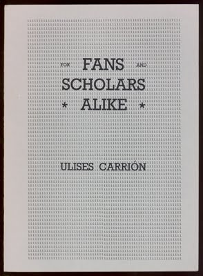
Some of our favorite books that have explored bookness include: A-C-R-C-I-T by Guy de Cointet, an unpronounceable newspaper with articles appearing in braille, Morse code and other forms of encryption, which he distributed through local news outlets to provoke thought about the legitimacy of information; For Fans and Scholars Alike by Ulises Carrión, a book that Johanna Drucker has neatly summarized as the “genre of self-conscious codex”; Essential Word and Phrases for Tourists and Travellers by Diesel, a clothing catalogue that poses as a foreign language phrasebook; The 2010 Gerrit Rietveld Academie prospectus by Hanne Lippard, for which she carefully stacked and arranged scraps of wood from the school woodshop as abstract ‘sculptures’ to represent each academic department (instead of showcasing student work) while the page information rotates in response to each configuration; and Une etrangére lit L’Étranger (An outsider reading The Outsider) by Makoto Yamada, a new edition of the novel based on the words highlighted by a previous reader.


![]()
![]()
![]()
![]()
![]()
![]()
![]()
As self-referential as you’ve described conceptual book design, how does your own particular place and context figure into your approach to the project?


Place and context were definitely important factors. In London the growing popularity of the risograph stencil duplicator has inspired a graphic design scene that is renewing the appreciation for printed matter, especially books. There are at least five official risograph print houses operating within the city, and many more below the radar. We decided to use risograph for our book to support this local culture but also to achieve an imperfect print quality that is no longer achievable through offset printing after the invention of film-less direct-to-plate technology. We felt this was in tune with Jaime Gili’s work since he references Modernist utopias that are still alive today.
So tell us about the book chosen for Gili’s exhibition.
The final book, Jaime Gili: Repetition, designed by Hyunho Choi, departs from tendencies that can be observed in Jaime’s work: repetition, scale and simultaneity. Hyunho’s design was chosen for having the most consistent and coherent integration of concept and form, for encompassing all four dimensions of the book, and for exploiting the risograph printing process (misregistration, halftone screens, etc.) Readers can experience Jaime’s work from different vantage points through a sequence of recurring (after)images that echo and bleed across consecutive pages while changing at varying paces through color, cropping and composition.
![]()
![]()
![]()
![]()
What were the other books like?


No two books were alike. One participant transformed an interview between Jaime Gili and Pablo León de la Barra (recorded during a train ride) into a travelogue interspersed with glimpses of the work being discussed while requiring readers to zigzag across the recto/verso page divide. Another participant manipulated Jaime’s work to the point of becoming something else, which was fascinating to watch so many thresholds being tested at once — fidelity, accessibility, legibility, etc.
Accessibility and legibility suggests you have a typical reader (or viewer) in mind?
We’re of the mindset that if we cater to existing audiences we’re likely to produce more of the same, but if we investigate the things that matter to us most, hopefully that will resonate with people with similar interests, or better yet, create new readerships.
Will there be another Booksfromthefuture next year?
In Spring 2013 we will be running a ten-week (rather than ten-day) version of the workshop in collaboration with Darren Raven and the Design for Graphic Communication course at the London College of Communication. This time we will design and publish a book on design education. We’re currently looking for contributors and a call for entries can be found on our website soon.
And finally, what did you two learn this summer?
We acquired a deeper understanding of ‘conceptual design’, by which we mean: design in which form-follows-concept, design that questions itself or its surroundings, or design in which the investigation or experience of a concept is its function. To some extent, all design is conceptual but not all design is concerned with the utility of concepts, or the strategic use of aesthetics and materials as a means of experiencing and appreciating concepts.
